How to tell a story with data
Data visualisation ·The inspiration
It all started with a workshop on how to create an effective chart by Cole Nussbaumer Knaflic at the Tableau User Group London. It was so inspiring and captivating, she managed to engage the public asking for their own recommendations and ideas. I thought to do the same in my company, as we have a big data team and we encourage the business to use a self-serve platform to answer their own data questions.
To start with, I read again Storytelling with data. The book is a great starting point for anyone who wants to enhance their ability to use data visualisation and storytelling to bring people to action, once they have a good point supported by data. It was the second time I read it, and every time its clarity and effectiveness amaze me.
The planning
I wanted to copy the same structure she used, but then I felt my level wasn’t quite the same and I wanted to add my own personal experience to the presentation, to make it more compelling. Like she illustrates in her book I started off with a bunch of post-it on a wall: creating the structure of your presentation with sticky notes or on a whiteboard, you don’t grow attached to your work and you have more flexibility and freedom to arrange it.
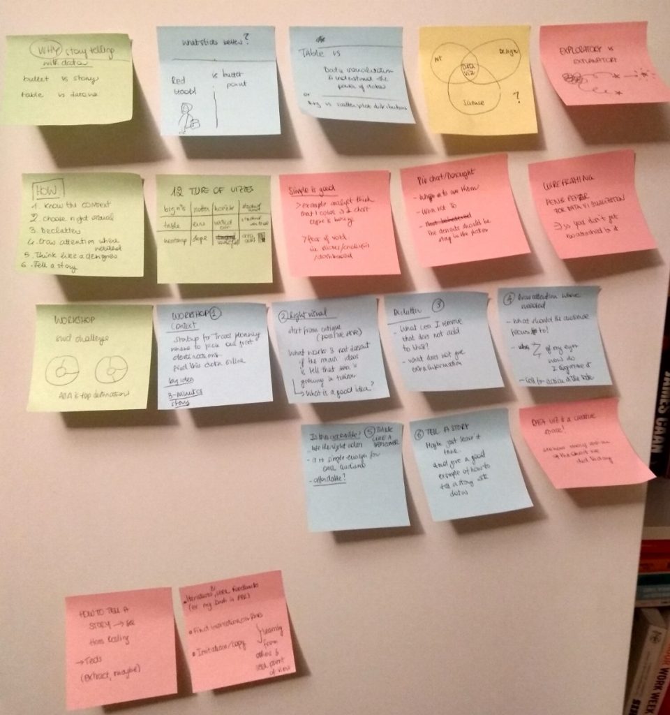
After this exercise I knew the outline of my presentation:
- Why storytelling with data
- How to tell a good story with your data using the steps from the book
- Workshop / practical part
The final presentation
Only then, I start refining the sections one by one. For the why I wanted to highlight why using a story is effective and the power of data visualisation to see patterns and trends at a glance. In the how to I wanted to follow the principles in the book Storytelling with data: </p>
- Understand the context
- Choose an appropriate display
- Eliminate clutter
- Draw attention where you want it
- Think like a designer
- Tell a story
The main section has to be the 2, which includes a selection of widely used charts and when to use them. The final result was well received and – I hope – increased awareness around data visualisation when presenting a business case.
The final result is below.