Edward Tufte and the principle of Graphical Integrity
Data visualisation ·My favourite meet up in London
Often you learn more talking with people and sharing your experience than studying on your own. In London, there are plenty of opportunities for networking and knowledge sharing and my favourite place is definitely Tiny Tableau Talks, a selection of 5 minutes talks about data visualisation and storytelling. I love it so much because:
- In 5 minutes you have to keep it short and often you go straight to the core concept
- Most of the talks are useful tips
- It is open to anyone, not just the experts, as long as you have something interesting to share
- Even if most of the talks are about Tableau, the lessons you learn are often generic and applicable to any data visualisation tool you’re using
- The organisers are great and help you to get ready to give a talk.
My experience
I’ve been to some of these meet-ups and learned so much, that I felt I have to give back to the community and do my own tiny talk. I am particularly fascinated by history in general because I like to know how and why things are the way they are, when did they change, when people started to formalise some concepts and why? Data visualisation is not different, and despite being a recent field it has an awesome history to discover.
Choosing the subject
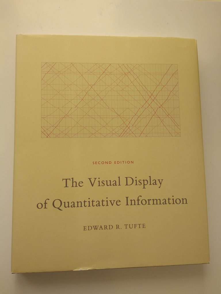
One of the pioneers in data visualisation and graphical representation of information is Edward Tufte, and I loved his masterpiece The display of quantitative information, which is included by Amazon in the top 100 books of the 20th century.

He formalised a lot of principles of Data Visualisation before digital tools were so popular and mostly journalists were using charts to make news more informative.
I then asked myself: which of Tufte’s lessons – born in paper design – are still applicable in digital design?
The principle of graphical integrity
The first principle illustrated by Tufte is the principle of graphical integrity, which is pushing for truthfulness in data representation. The core elements are:
- Graphic should respect the proportions of the numbers they represent
- Use labelling to help understanding
- Show data variation, not design variation
- When displaying monetary variation over time, is better to standardise the units (e.g. consider inflation)
- Don’t use more dimensions than the ones included in the chart (avoid 3D)
- Don’t quote data out of context
The content of my presentation
I couldn’t include all these in 5 minutes, so I cut down to three points and included a practical example for each of them. You can find the final result in the video below.
My thoughts on Tufte’s book
In my opinion, the book is addressing mainly journalists and designer, that’s why there is such a prescriptive approach. Nonetheless – especially now that we are bombarded with reading opportunities – journalists and designers need to capture the eyes of the reader, with both truthful and visually appealing representations.
More learning along the way
Googling around Data Visualisation History you can find this amazing project to outline a timeline with milestones of the history of data visualization, by Michael Friendly along with his books, papers and presentations. Here are some curiosities: the bar, line and pie chart were all introduced by William Playfair in the 18th century, whereas Tufte is the inventor of the sparkline, that was first used in 2004.