A 3D exploding pie chart: not a good idea.
Data visualisation ·A panel in a history of printing museum
Last week I was visiting this museum about the history of invention and development of printing in Bassano Del Grappa, a small little village in the North of Italy. The museum was really well presented and it reminded me how the introduction of printing marked a revolution: more and more books were available and the knowledge was faster to spread.
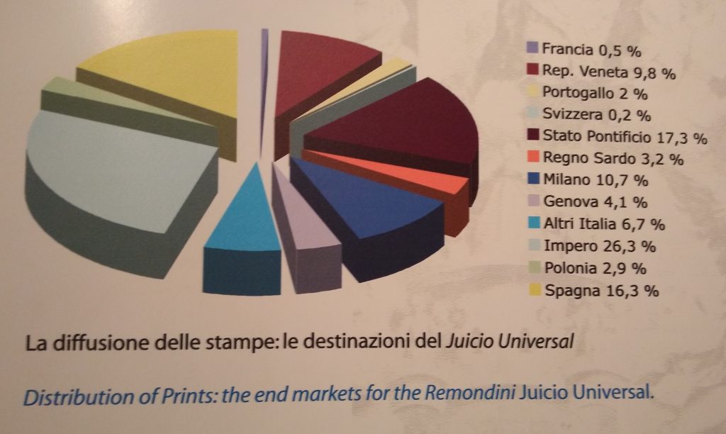
The museum focus was about the Remondini’s: a famous family running a publishing business, particularly active in the ‘700 and based in Bassano. Historians knew it was flourishing, because it was the main reproducer of a satiric depiction called the Juicio Universal, that was widespread and talked about in all the Catholic countries. To point out how wide was the reach of the prints, a panel in the museum proposed this chart
And I decided to use this post as a commentary and an opportunity for a make over.
Why the 3D pie chart does not fit for purpose?
Looking at the panel I find myself going back and forth between the chart and the legend, struggling to understand what the aim of the chart is and I actually start looking at Svizzera and then look back to the Impero because the colours are so similar. Here some more reasons why this chart is not a good choice:
- Too many colours make it hard to decide which is which clearly
- Spagna looks bigger than Stato Pontificio, even though the latter is 1% bigger in reality: this is due to the deformation caused by the 3D effect
- At a glance I cannot understand what is going on and I need to read the whole legend.
What are better options?
What alternative can I use to display the data? Of course the answer is it depends! On what – I heard you asking? – on the message you’re trying to convey.
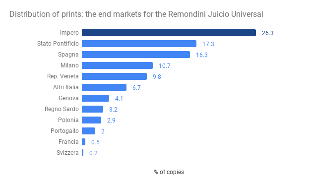
If it is important to compare how many of the reproductions were going in each region, I would use a bar chart, maybe highlighting the top region, like in the image below.
If instead is important to mark that so many different regions were receiving these reproductions I would just list the number of different end markets and compare it to the number of existing regions at that time. Or alternatively give a sentence like X% of the number of books circulating in Europe where produced from Remondini, something along the line of this

To summarise the nature of this data-set makes it hard to choose a pie chart, both because the number of colours is too high and because some of the slices’ sizes are so similar. The 3D effect does not help – distorting the proportion of the real numbers. Curious to see when is a good idea to use a pie chart? Have a look at my presentation on how to better tell a story with data.