Let’s practice with this month #SWDchallenge.
Data visualisation ·#SWDchallenge and where to find them
One of my favourite author about data visualisation, Cole N. Knaflic, published a new book Storytelling with data: Let’s Practice!
I am keen of getting my own copy, but while waiting I decided to take part in this month challenge. If you’re interested too, she launch one every month on her website.
October 2019 SWDchallenge
This is the extract from the latest post. I’ll follow the steps.

Step 1
My assumptions are:
- The tiers are ordered by best to last (A to D)
- As the sum of % of Accounts doesn’t sum up to 100% and neither the % Revenue – either I have missing tiers or this is the just the new clients, but then I’ve just had a really good year if my revenue growth has been so big.
I would ask where the is the revenue missing to the 100%.
Step 2
This is how I re-designed the table using Google Sheets.
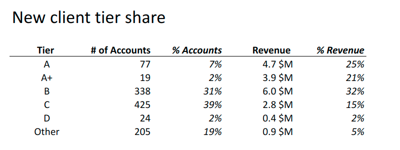
Here is the list of actions, and my thoughts behind them.
- Kept the order of the tiers, assuming the order have a meaning
- Right align the numbers and percentage – to make the scan and comparison quicker for the reader
- Delete background in the titles as the contrast wasn’t great for readability
- Remove the alternate line background, as the new line separation is already enough
- Added the unit and currency to each value in the table – to make it clear we are talking Million $, and remove it from the title as unnecessary
- Added the Other tier – so that we have the whole and not just part of it, this is following my assumption at step 1.
- I made the % italic, to sort of create a link between numbers and related %
- Use the default font of Google sheet, for consistency.
Step 3
The title of the table and the exercise suggest to look at the tier share in terms of number of accounts and revenue, and compare those two.
I decided to stick with a simple visual, a column chart where I compare only the revenue and account share for the top tiers (so I excluded the Other bucket).
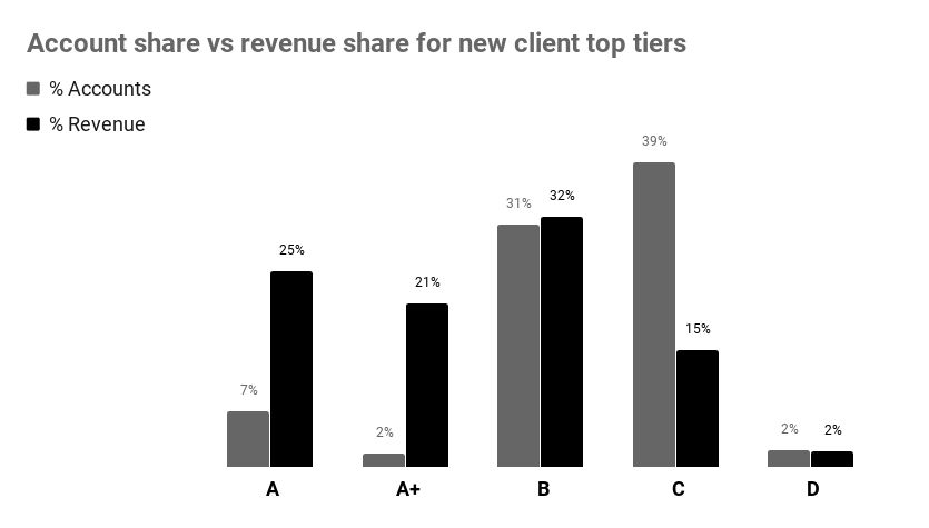
Again I used Google Sheet, selecting the column chart and putting the two share % side to side for an easier comparison.
I put the legend on the top left, to be picked up first thing by the user and kept the order of the tiers.
Now having them side to side I can see how A, A+ are giving most of the revenue, while forming only 9% of all accounts. While C, D give 17% of the revenue, but has 4 times more accounts.
I went for a black and grey version, bit old style and boring, but as effective – and will be the same if printed!
The link with both the data, the table and the chart can be found here. Hope you find this post useful, I will submit this on the SWDchallenge!